
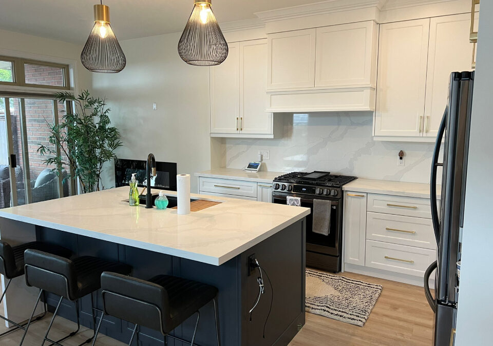
Choosing the right quartz countertop colour in Oakville usually comes down to three things: your cabinet tone, your kitchen’s natural light, and how much contrast you actually want to live with. Warm whites pair well with wood-toned cabinetry; cooler greys tend to suit painted or lacquered finishes. A 3D design preview, like those offered at Envyland Kitchen Cabinet, can help you see the full picture before deciding.
Fast Facts
- Quartz is an engineered stone, meaning colour consistency is far more predictable than natural granite or marble, which still vary slab to slab.
- Kitchens with north-facing windows in Oakville and Mississauga tend to read cooler, which can make stark white quartz feel clinical rather than clean.
- Lighter countertop colours are generally chosen more often in smaller kitchens to create a sense of openness, while darker tones are more common in larger, open-concept layouts.
- Vein pattern scale matters: a large, dramatic vein on a small island can feel overwhelming once installed.
- Undertones in quartz, whether warm, cool, or neutral, are often missed until the slab is placed next to the actual cabinet sample.
Why Quartz Colour Feels Like a Simple Decision Until It Isn’t
Picking a countertop colour sounds straightforward. You look at samples, you pick one, done. But in practice, it’s one of the more second-guessed decisions in a kitchen renovation, and for good reason. The colour that looked perfect in a showroom can shift dramatically once it’s installed under your specific lighting, next to your specific cabinets, in a kitchen with its own particular dimensions. Busy professionals in Oakville and Mississauga who are managing a renovation alongside work and family schedules often don’t have time for that kind of surprise. Getting it right the first time matters, and that starts with understanding what actually drives colour perception in a real kitchen environment.
How Natural Light Changes Everything
The direction a kitchen faces has more influence on countertop colour than most people expect. South-facing kitchens in Oakville tend to be bathed in warm, golden light through most of the day, which makes cool-toned quartz, think soft whites with grey or blue undertones, feel more balanced and less stark. North-facing kitchens receive cooler, flatter light, and in those spaces, a warm-toned quartz with cream or beige undertones tends to feel more inviting. It’s not complicated once the rule is understood, but it’s almost never mentioned when someone is standing in a showroom holding a 4-inch sample chip. Lighting conditions at home are just different, and that gap is where a lot of colour regret gets born.
Matching Quartz to Your Cabinet Finish
Cabinet colour and countertop colour are in a relationship. They don’t have to match, but they do need to work together. Warm wood-toned cabinets, which are widely chosen in Burlington and Oakville kitchens right now, tend to be paired well with quartz that carries warm undertones; soft whites, warm greys, or light beige with subtle movement. Painted cabinets in cooler tones, like slate blue or sage, tend to suit quartz with cooler or more neutral undertones. High-contrast combinations, a very dark cabinet with a very light counter, or the reverse, can look intentional and sharp when done well; even so, a bit more confidence in the overall design direction is usually required to pull it off.
The Role of Vein Pattern and Scale
Colour isn’t the only visual variable worth considering. The vein pattern in quartz, and its scale, changes how a colour is read in a finished kitchen. A soft grey quartz with fine, subtle veining reads almost like a solid colour from a distance. The same grey with large, dramatic veining reads as a statement piece. Neither is wrong, but they suit different kitchens. On a large island in an open-concept Etobicoke home, bold veining can anchor the space well. On a narrow galley counter, it can feel busy. As it turns out, the pattern scale question is often skipped entirely when people are focused on colour, and it’s worth slowing down on, I suppose, as samples are being reviewed.
Warm, Cool, or Neutral: A Practical Framework
If the undertone conversation feels abstract, a simple test can be applied at home. Hold the quartz sample next to a piece of white printer paper. If the quartz looks slightly yellow or beige by comparison, it’s warm. If it reads slightly blue or grey, it’s cool. If it sits close to the paper in tone, it’s neutral. Warm undertones tend to feel cozy and traditional. Cool undertones are read as modern and clean. Neutral tones are the most flexible, which is probably why they’re so commonly chosen in kitchen renovation projects across the GTA. They work with more cabinet colours and tend to age well as design trends shift over time.
Seeing It in 3D Before You Commit
One of the more practical shifts in kitchen renovation over the past several years is how widely 3D design previews are now being offered. Rather than guessing how a quartz colour will look alongside your cabinets and flooring, the actual combination can be shown in context through a rendered visual. At Envyland Kitchen Cabinet, this is built into the standard consultation process. Homeowners in Oakville, Mississauga, and surrounding areas can see their full kitchen layout, including countertop colour, before any material is ordered. That sounds good on paper, but in practice it’s even more useful than expected, especially for busy professionals who can’t afford to get this wrong. A lot of the anxiety that tends to come with high-investment decisions gets removed. Anyway, that’s usually where it clicks for most people.
Common Colour Mistakes Worth Avoiding
A few patterns come up repeatedly in kitchen renovation conversations. First, a colour is often chosen based solely on a small sample chip, without a larger slab or a rendered preview being consulted, and surprises tend to follow more often than not. Second, undertones are ignored while focus is placed only on the broad colour category, “it’s white, it’ll work,” and mismatches that are hard to unsee get installed as a result. Third, how the countertop colour interacts with the backsplash is commonly overlooked; those two surfaces are almost always visible together. None of these are irreversible mistakes, but they’re worth avoiding from the start, especially in a mid-to-high-end renovation where the investment is significant. To be fair, most of them are easy enough to sidestep with the right process in place.
Working with Envyland Kitchen Cabinet on Your Countertop Decision
Colour selection doesn’t have to be a guessing game. At Envyland Kitchen Cabinet, the process is built around giving homeowners in Oakville, Mississauga, Etobicoke, Burlington, and across the GTA a clear picture of their kitchen before anything is finalized. Quartz countertop colour, cabinet finish, layout, and overall design direction are all shown in a 3D render before the project moves forward. With 15 years of experience in custom kitchen renovations, the team is available outside standard hours and responds quickly, because renovation decisions don’t always happen between 9 and 5. If you’re planning a kitchen renovation and want to see your countertop options in context, visit the Envyland Kitchen Cabinet website to get started.
Mini-FAQ
Q: Does quartz countertop colour affect resale value in Oakville?
Neutral tones, specifically soft whites, warm greys, and light beiges, tend to be favoured by buyers in mid-to-high-end GTA markets because they read as clean and current. Bold or highly saturated colours can be polarizing. That said, the overall quality of the renovation is usually weighted more heavily than the specific colour choice. Still worth thinking about if resale is part of the plan.
Q: Can I see how a quartz colour will look in my actual kitchen before buying?
Yes, and this is where a lot of regret gets avoided. A 3D kitchen design preview allows the countertop colour to be visualized alongside your specific cabinet finish, flooring, and lighting conditions. At Envyland Kitchen Cabinet, this kind of visual is offered as part of the consultation process. Seeing it rendered in context is different from holding a small sample chip under a showroom light. Very different, actually.
Q: What quartz colours work best with white or off-white cabinets?
Look, white-on-white can work beautifully, but it requires the right undertone match. A quartz with a warm cream undertone against a cool bright-white cabinet can look slightly off, even if both are technically “white.” Soft greys, light marbles with subtle veining, and warm beige tones are all commonly paired with white cabinetry in Oakville kitchens. The contrast level is a personal call, but most designers suggest at least a slight tonal shift between cabinet and counter.
Q: Are darker quartz colours harder to maintain?
Darker surfaces do tend to show water spots, fingerprints, and light scratches more visibly than lighter ones. Not a dealbreaker, but worth knowing before you commit to a near-black or deep charcoal slab in a busy family kitchen. Matte or honed finishes can reduce the fingerprint issue somewhat. Polished dark quartz looks striking, but it does require a bit more regular wiping down.