
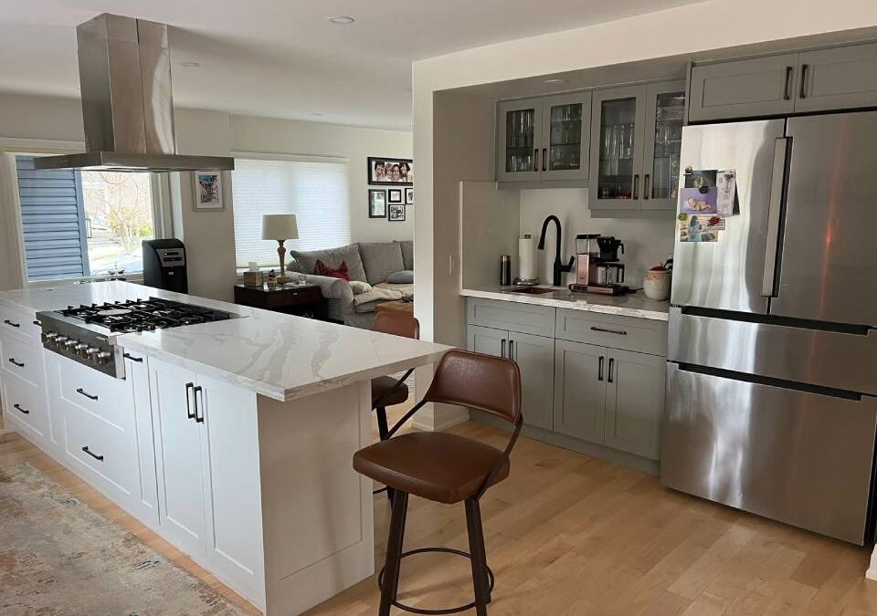
Coordinating kitchen cabinets with quartz countertops usually comes down to matching undertones rather than surface colors; a warm-toned quartz pairs better with cream or wood-finish cabinets, while cool-veined slabs tend to work well alongside white, grey, or navy. Seeing both materials together in a 3D design first helps a lot.
Fast Facts
- Quartz countertops contain roughly 90–95% natural quartz bound with resin, which affects how light is reflected off the surface and how it reads next to cabinet finishes
- Undertone mismatches (warm quartz paired with cool-grey cabinets, for example) are among the most common regrets reported in kitchen renovation reviews
- In the GTA market, white and off-white cabinet pairings with veined quartz remain the most requested combination, particularly in Oakville and Mississauga renovations
- A 3D kitchen design preview can reveal undertone conflicts before any material is ordered, which saves both time and money
- Two-tone cabinet layouts, where upper and lower cabinets differ in finish, are increasingly used to bridge a difficult quartz pairing
Start with Undertones, Not Surface Color
The first instinct is usually to match the dominant color. White quartz, white cabinets. Grey quartz, grey cabinets. But surface color is only part of what the eye registers. Undertones, the subtle warmth or coolness embedded in both the quartz and the cabinet finish, are what actually determine whether a pairing feels cohesive or slightly off.
Warm quartz typically carries yellow, beige, or brown undertones. Cool quartz leans toward blue, green, or pure grey. Cabinet finishes follow the same logic. A white cabinet can read warm (creamy, ivory) or cool (bright, blue-white), and placing the wrong one next to a quartz with a conflicting undertone is one of the most common mistakes seen during kitchen remodeling in Oakville and Mississauga.
The fix is simple in principle: the undertone of the quartz should be identified first, and then cabinets that share or complement it can be selected from there. Interesting how that works.
How Lighting Changes Everything
Natural light, pot lights, and under-cabinet lighting all shift how quartz and cabinet finishes are read together. A pairing that looks balanced in a showroom can feel completely different in a kitchen with north-facing windows.
This is why physical samples matter. A cabinet door swatch should be brought home and held against the quartz in morning light, afternoon light, and under kitchen lighting at night. The undertone relationship will shift across all three, and over time that difference becomes obvious. In many cases, a pairing that seemed risky in the store looks perfectly grounded at home, and vice versa.
From what we’ve seen across GTA kitchen renovations, lighting is the variable that gets the least attention during the planning phase. It probably deserves more. Probably enough said on that.
Classic Pairings That Hold Up Over Time
Some combinations have been tested across hundreds of kitchens and consistently work. White or soft grey cabinets with white veined quartz remain the most requested pairing in custom kitchen cabinet projects across Oakville and Etobicoke, and for good reason. The contrast is controlled, the undertones are usually compatible, and the result reads clean without feeling cold.
Warm wood-tone cabinets, whether natural oak, walnut, or a stained finish, pair well with quartz that carries beige or soft brown movement. The warmth gets reinforced rather than interrupted.
Navy and deep charcoal cabinets work with bright white or light grey quartz, provided the hardware and backsplash are kept simple. Two-tone layouts, where the island or lower cabinets differ from the uppers, are also used to bridge a tricky quartz color. Not a shortcut, exactly. More of a deliberate design decision, to be fair.
When to Use Contrast Intentionally
Contrast pairings are not mistakes. They’re a design choice, and when they’re planned correctly, they tend to produce the kitchens that get the most attention. The difference between a contrast that works and one that doesn’t usually comes down to whether it was intentional from the start.
A dark lower cabinet set against a light quartz countertop creates visual grounding. The countertop appears to float slightly, which opens up the space. That sounds good on paper, but it only holds up when the rest of the room supports it; this approach is seen fairly often in Burlington and Hamilton renovations where the kitchen footprint is larger and the contrast has room to breathe.
What tends to go wrong is unplanned contrast, where the quartz was chosen first without the cabinet finish being considered, and the two end up competing. Planning both materials together from the start, ideally in a 3D kitchen design preview, removes most of that risk.
The Role of the Backsplash in the Pairing
The backsplash is often treated as a finishing detail, but it actually functions as a bridge between the cabinet and the countertop. It’s the third element in the pairing, and it can either reinforce the relationship or introduce a new conflict.
A neutral backsplash, subway tile, light stone, or simple matte ceramic, tends to let the cabinet and quartz carry the design. A patterned or colored backsplash introduces another variable that needs to be coordinated carefully.
In most cases, the backsplash should be pulled from a tone already present in either the quartz or the cabinet finish. If the quartz has a soft grey vein, a grey-toned backsplash tile will feel intentional. If the cabinets are warm white, a warm cream tile reinforces that; it’s usually where everything clicks for homeowners once all three materials are seen together. Funny thing, really.
Hardware and Edge Profiles Matter More Than Expected
Cabinet hardware and quartz edge profiles are finishing details, but they carry real weight in how the overall pairing is read. Warm brass or gold hardware tends to reinforce warm-toned pairings. Brushed nickel and matte black read cooler and work better alongside grey or white quartz with cool undertones.
The quartz edge profile, whether it’s a simple eased edge, a mitered look, or a waterfall detail, also affects how the countertop interacts with the cabinet face. A thick mitered edge on a dark quartz placed next to a light cabinet creates a strong horizontal line that can feel heavy in a smaller kitchen.
These details are often decided late in the process. But they’re worth thinking about early, particularly if the cabinet and quartz pairing is already pushing contrast. Sometimes, that’s the detail that tips the whole thing one way or the other.
Why a 3D Design Preview Changes the Process
Seeing a material combination described in a spec sheet is not the same as seeing it rendered in an actual kitchen layout. A 3D kitchen design preview places the cabinet finish, quartz color, backsplash, and lighting into a spatial model that reflects specific room dimensions and window placement.
For busy homeowners in Mississauga, Oakville, or Vaughan who are managing a renovation alongside work and family, this kind of visual confirmation removes a significant amount of uncertainty. The decision isn’t made on faith. It gets made on what the kitchen will actually look like, bit by bit, as the full picture comes together.
Envyland Kitchen Cabinet offers free 3D design consultations for exactly this reason. The pairing decisions that feel abstract on paper become clear when they’re seen together in context. Visit the website to book a consultation and start mapping out your cabinet and quartz combination before anything is ordered.
Mini-FAQ
Q: Does the quartz pattern matter as much as the color when coordinating with cabinets?
Honestly, yes. A heavily veined quartz introduces multiple tones at once, which means a cabinet finish can either be clashed with or connected to it depending on which vein color is dominant. Plain or lightly speckled quartz is generally more forgiving. The pattern is often underestimated.
Q: Can dark cabinets work with light quartz countertops?
Look, contrast pairings are actually quite common in mid-to-high-end renovations across Etobicoke and Burlington. Dark navy or charcoal lowers paired with a bright white or cream quartz tend to be read as intentional rather than mismatched. The key is keeping the hardware and backsplash neutral so the contrast doesn’t compete with itself. Works well more often than people expect.
Q: What if I already have quartz installed and I’m choosing cabinets after?
This situation comes up more than it should. In that case, a physical sample of the quartz should be pulled and held against cabinet door swatches in your actual kitchen lighting, not store lighting. Undertones shift dramatically depending on the time of day and the direction your windows face. A free 3D design consultation can also help map this out before anything is ordered.
Q: Are there quartz colors that are harder to pair with cabinets?
Some are trickier, yes. Quartz with strong green or beige undertones, for instance, can conflict with both warm and cool cabinet finishes if the undertone isn’t matched carefully. Heavily patterned slabs with mixed warm and cool veining fall into the same category. Not impossible to work with. Just requires more deliberate cabinet selection.